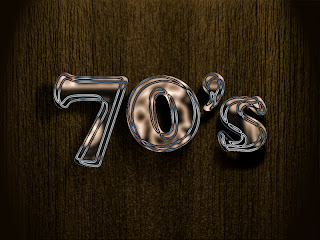
Here you go, the output of final tutorial for computer graphics 2. I'd prefer tutorial 1 more!
+Cheers+
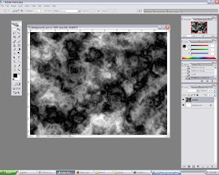 Open background.psd. Then create a new layer, fill it with black color. Next select RENDER filter, use either CLOUDS or DIFFERENCE CLOUDS. Play around to achieve nice cloud efx.
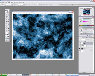 After the filter has been applied, open HUE and SATURATION, tick the COLORIZE box, and adjust to any color to liking, in this case blue. To make it slightly better, adjustment on BRIGHTNESS and CONTRAST are made.
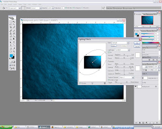 Go to channels, create a new ALPHA layer, apply the same techniques used for step 1. This to give the background a rough look. Next, make sure RGB layer is selected, open render filter and select LIGHTING EFFECTS. Adjust the values accordingly, the key is to get a nice overall lighting, not too dark nor bright.
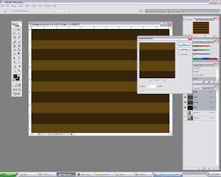 By using MARQUEE tool, create a rectangle and use dark brown as fill. Then duplicate the shape and arrange it through out the background, so that in the end it will look it has stripes. Apply a little bit of GAUSSION BLUR.
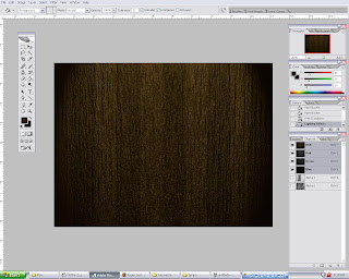 Step 3 and 4 is repeated to produce the final background. As you can see, the "wood" look improves from step to step. We would want it to look as real as possible. It can be easily achieved by doing experiments on the values (FILTER).
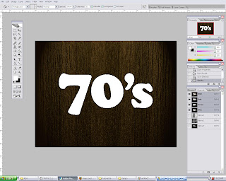 Te last element would be the main text. Go to path, and CTRL click the 70's layer to select it. Then go back to LAYERS, create a new layer, and fill it with white while the text is still selected.
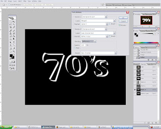 Now select channels, create a new alpha layer and duplicate it. So we will have two identical layers. For the first layer, move it 5 pixels up and 5 pixels to the left by using keyboard arrows. Repeat for the other layer, but 5 pixels down and 5 pixels to the right. After that, go to IMAGE and select CALCULATION. Set the source 1 layer to alpha 3, and source 2 layer to alpha 3 copy. Next change the BLENDING mode to difference. Click ok. This will basically render a chrome efx if its done correctly.
 Go to layers pallete and select 70's layer. Use HUE and SATURATION to change the text color. Any color will do as long as it matches with the background. Therefore brown-ish color tone wolud be the best option. To finish off, add a DROP SHADOW efx to the text, adjust the shading according to overall lighting.