Thursday, November 27, 2008

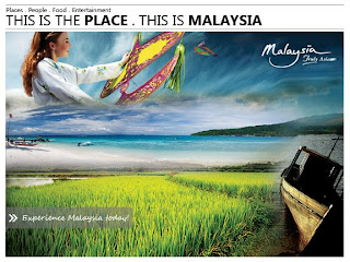
Assignmen 1: Final Outcome


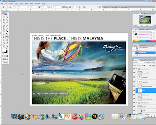
Haa. .Malaysia Truly Asia. *I just love the girl in baju kurung* Haha. Peace

+cheerio+
Assignment 1: The making

For this assignment, theres not much of fancy efx or filters used to produce the post card, just the basic ones that are from Tutorial 1 and 2, plus a little bit of idea and creativity! Simple but interesting. :D

Step 1:

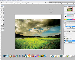
Create a new document and set the background to white. Open Paddyfield.jpeg and place the image in the middle of the canvas. By using TRANSFORM tool, slightly resize and adjust the image accordingly. Next, duplicate the image and set the BLENDING MODE to SOFT LIGHT. The purpose is to richen the original color of the image. Sometimes the image may look dull or faded, therefore by applying this step it will further enhance its original color.


Step 2:

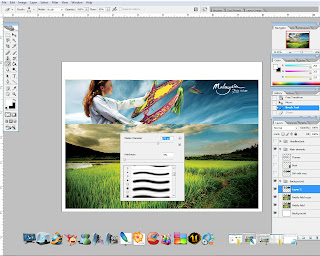
For the main element, several images will be used but the steps taken are pretty much the same except for the image arrangement. We start by opening Girlwau.jpeg. Drag the image over Paddyfield.jpeg and place it at the top. Since the image is small, again TRANSFORM tool is used to resize the image. Now that the image is aligned, next step is to make it blend in with the background image. The trick is very simple, hit E to activate ERASER tool and select FEATHER ROUND BRUSH. Set the brush OPACITY to 20-30% and start erasing the unecessary part of the image. The idea is to make it look like its part of the background image.


Step 3:

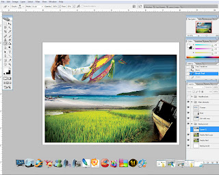
After done with the first element, lets proceed with the rest of the images. Step 2 is repeated on each and every image. This to ensure the color of all of the images will look even. If step 2 is not repeated, all of the images will not blend in well together. The images are placed accordingly to create a nice overall flow balance without making it look scattered all over the place.


Step 4:

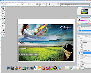
Now that the main element is completed, a little adjustment on CURVES and LEVELS are made as a final step to finalise the image. The purpose is to adjust the brightness and the overall color. As a result, the image look more vibrant than before. Next i would like to add a small tag on the corner of the image along with a message. A rounded rectangle with 20px radius is created by using RECTANGLE tool, and light grey as fill. Select ERASER tool, SQUARE brush, and erase one end of the rounded rectangle. After that, set the OPACITY to 50%. The background for the tag is done. "Experience Malaysia today !" text is added to the tag (white SEGOE SCRIPT font, 12pt font size).


Step 5:

For final touch, a headline is added at the top of the image. Also, two horizontal lines are created to wrap up the headline (LINE tool, 2px weight), this to make the headline look neater. Assignment 1 is completed.

Asignment 1: Project charter

Project Charter Assignment 1

Assignment 1 Title: Printout Postcard for the theme “Malaysia, Truly Asia”.

Project Start Date: 25 November, 2008.

Project Finish Date: 28 November, 2008.

Project Manager: Azri Fikri B. Osman

HP: 012-6036465

Email: azri_F@ymail.com

Website: http://mcg1014-1081106703.blogspot.com/

Project Objective: Students are to create a multi-cultural event for a post card. The theme would be “Malaysia, Truly Asia” which is the official slogan for Malaysia Tourism. Students are to show the multi-cultural aspects of Malaysia culture or life as a positive feature to attract tourist into this country.

Approach:

How do you create the postcard?

The postcard is produced by combining a couple of images with diffrent settings and effects. All these are done in Photoshop CS2

Using what images?

Images that are found on google, and some personal images are used to make up the postcard.

What tools at Photoshop you use to edit the images?

There are various tools that are used to crate the postcard, such as crop, marquee, lasso, blur and smudge tools. Filters are also used to get nice effects.

Write here about the idea of your postcard, is it your own Idea or References?

I combined my own ideas plus some reference found on the internet. By combining from both source, the output result will be better as the ideas are not restricted to just one simple idea.

Roles and Responsibilities:

For time management, the time estimated to complete the assignment is 2-3 days, depending on the amount of time spent on each Photoshop session. Usually it only takes 1 day to complete any exercise given. But as for this assignment, a research is required in order to create the post card, e.g relevant images, layout, etc. Since i started on the 25th, I'll show some of assignment 1 progress to madam Lydia on the 26th to get feedback or comments to help further improve the result. Before submitting the assignment, these guidelines must be fulfilled :

  1. “Students are to submit the original PSD files (DO NOT FLATTEN THE FILE) together with the images used in the postcard. Call the file StudID_asssignment1.psd”.

  1. “Place the files in separate folders. One folder containing the PSD file called Postcard. The other images used are to be placed in a folder call Postcard_ref”.

  1. Print the postcard. Postcard size is 6x8 inches with 300 resolutions.

Comment:

For this assignment, its quite easy and direct. Not much of fancy efx or filters are needed to make it interesting. Just simple tools such as ERASER, BRUSH, CURVES, LEVELS and BLENDING MODE are used to make up the post card. Much of these tools are from Tutorial 1 and 2, so its not a big deal in completing this assignment. Overall i enjoyed doing this assignment, although the steps taken are the basic ones but the outcome was awesome! I'm very surprised with the final outcome. Looking forward for assignment 2.
Wednesday, November 26, 2008

Tutorial 2: Final outcome


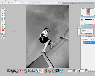
Here's the final outcome for tutorial 2. Just a simple editing with tutorial one efx.

Tutorial 2: The making

Step 1:

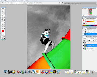
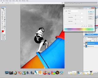
Open any of the 3 images provided. I chose the image of a boy playing at a playground. Duplicate the image. Next use DESATURATE to turn the top RGB image into Black and White. Then i opened EXPOSURE and play around with the sliders to fine tune the image.


Step 2:

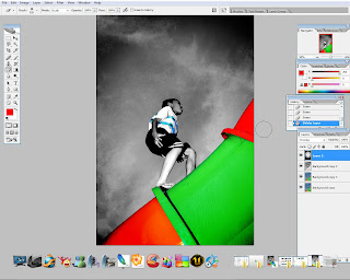
By using MAGNETIC LASSO tool, one part of the pipe is selected. Next ERASER is used to clear off the highlighted part. To change its color, open up HUE/SATURATION, mark the COLORIZE option box, and adjust accordingly.


Step 3:

For the other part of the pipe, just simply repeat step 2 to yield the same result. Also, for the monster cookie printing on the boy's t-shirt as well.


Step 4:

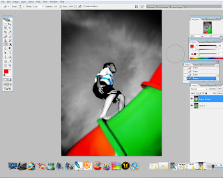
This is an additional step. Next a new layer is applied. Then, select RADIAL GRADIENT tool, and set the color to black and white. Apply the gradient and change the blending mode to OVERLAY. This to make it blend with the background. Use ERASER tool to clear off unnecessary portion of the gradient.


Step 5:

To finish off, merge down all layers. After that, RADIAL BLUR filter is applied to the image. the function is to create zooming efx.

Wednesday, November 19, 2008

Tutorial 1: Final outcome.

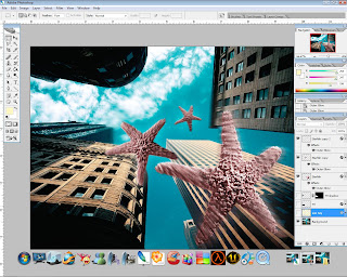
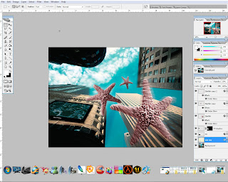
Tadaa. My starfish-licious tutorial 1. :D Not bad for a noob, though it takes hours to complete!

+Cheerio+

Tutorial 1: The making

The videos provided are very useful and easy to follow. The concept is similar like teaching new born babies, every single step is explained clearly and details are superb. So with a lil bit of time and google-ing hours, the first tutorial is done. Here's the step-by-step process:

Step 1:

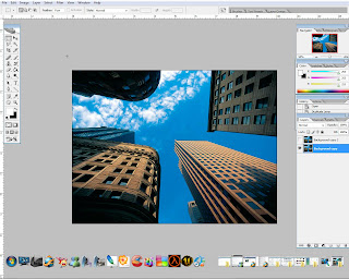
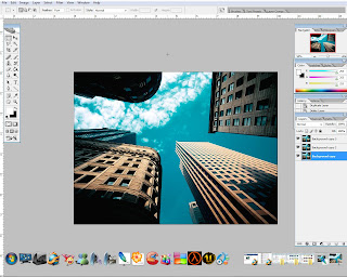
Open skyscraper.jpg in Photoshop. Here's the original skyscrapper image that is going to be used as background. The overall color seems to be quite dull, so to make it interesting i'm going to use HDR efx to give the background a new overall look. Well its not a real HDR effect, but something close to HDR.

Step 2:

Multiple layers with different layer settings are used to make up the so called HDR efx. The idea is to play around with different BLENDING MODE to achieve nice effect. In this case, i altered the color of the sky and clouds, plus a lil bit of lighting for the sky scrappers. This is just to enhance the surrounding environment.


Step 3:

Next is to add the star fish. Since the overall color of the background has changed, i think it would be better to change the color of the star fish also, so that they will blend better with the background image. After that, OUTER GLOW effect is applied to all star fish image with different level of opacity and fill. To get the falling efx, a mixture of GAUSSION BLUR, RADIAL BLUR , and FADE filters are used on each and every star fish image. Play around with the values to achieve good efx. We want to make it look as natural as possible without much exaggeration.

Step 4:

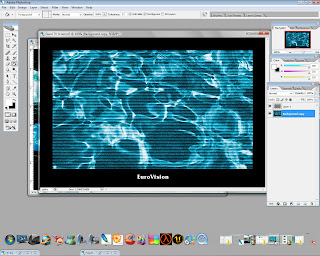
Next is the LCD TV screen. If the original image is used, it might interrupt the overall look and feel. Therefore, to make it blend in with the rest of the images, i've decided to change the color of the screen itself. Very simple, just use HUE/SATURATION, mark the COLORIZE option box, and use the sliders to get different combination of color. Again, the idea is to get it blend in well with the background image. The image still lacks in realistic, so SKETCH>HALFTONE PATTERN filter is used to render the real TV efx.


Step 5:

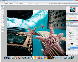
Next is to place the LCD TV created earlier to one of the building. FREE TRANSFORM tool is used to adjust the image so that it is aligned well with the building. Now, the TV needs some shadow, so DROP SHADOW efx is added and placed underneath the TV image. Adjust the opacity necessarily.


Step 6:

Lastly, i 've added a sunray efx to the overall image, to achieve a sunny day look. Its hard to see the efx actually, because the opacity of the layer is set to 15%. Anyways, im happy with it and i think the image look better now!


+cheerio+