Thursday, December 25, 2008

Tutorial 6: Final Outcome


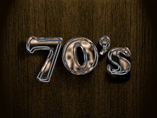
Here you go, the output of final tutorial for computer graphics 2. I'd prefer tutorial 1 more!

+Cheers+
Tutorial 6: Step by step

This is the last tutorial for this semester. It may look simple, but the steps taken are way complicated compared with the other tutorials.

Step1:

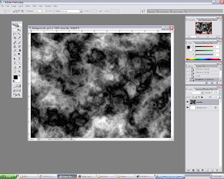
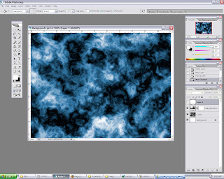
Open background.psd. Then create a new layer, fill it with black color. Next select RENDER filter, use either CLOUDS or DIFFERENCE CLOUDS. Play around to achieve nice cloud efx.
Step 2:

After the filter has been applied, open HUE and SATURATION, tick the COLORIZE box, and adjust to any color to liking, in this case blue. To make it slightly better, adjustment on BRIGHTNESS and CONTRAST are made.
Step 3:
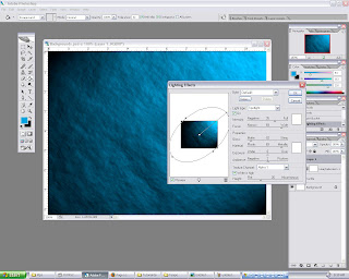
Go to channels, create a new ALPHA layer, apply the same techniques used for step 1. This to give the background a rough look. Next, make sure RGB layer is selected, open render filter and select LIGHTING EFFECTS. Adjust the values accordingly, the key is to get a nice overall lighting, not too dark nor bright.
Step 4:


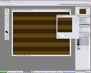
Now to get this wood efx background, again step 4 is repeated but with different values such as color, texture, and lighting. To get more realistic wood efx, play round with different FILTER>RENDER>FIBERS values.

Step 5:

By using MARQUEE tool, create a rectangle and use dark brown as fill. Then duplicate the shape and arrange it through out the background, so that in the end it will look it has stripes. Apply a little bit of GAUSSION BLUR.
Step 6:

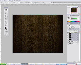
Step 3 and 4 is repeated to produce the final background. As you can see, the "wood" look improves from step to step. We would want it to look as real as possible. It can be easily achieved by doing experiments on the values (FILTER).
Step 7:

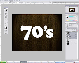
Te last element would be the main text. Go to path, and CTRL click the 70's layer to select it. Then go back to LAYERS, create a new layer, and fill it with white while the text is still selected.
Step 8:

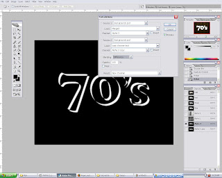
Now select channels, create a new alpha layer and duplicate it. So we will have two identical layers. For the first layer, move it 5 pixels up and 5 pixels to the left by using keyboard arrows. Repeat for the other layer, but 5 pixels down and 5 pixels to the right. After that, go to IMAGE and select CALCULATION. Set the source 1 layer to alpha 3, and source 2 layer to alpha 3 copy. Next change the BLENDING mode to difference. Click ok. This will basically render a chrome efx if its done correctly.

Step 9:

Go to layers pallete and select 70's layer. Use HUE and SATURATION to change the text color. Any color will do as long as it matches with the background. Therefore brown-ish color tone wolud be the best option. To finish off, add a DROP SHADOW efx to the text, adjust the shading according to overall lighting.
Monday, December 22, 2008

Assignment 2: Final Outcome


Assignment 2 is completed!

Project Charter: Assignment 2

Assignment 2 Title: Digital Wallpaper

Project Start Date: 12 December, 2008

Project Finish Date: 23 December, 2008.

Project Manager: Azri Fikri B. Osman

Email: mcg1014.1081106703@gmail.com

Blog url: http://mcg1014-1081106703.blogspot.com/

-------------------------------------------------------------------------------------------

Project Objective

Learning process of implementing the multiple tools using Photoshop in creating the digital wallpaper regarding ‘MMU FOM Open Day’. In this digital wallpaper, I will be promoting Faculty Of Management to the people who is looking forward to study in MMU and which courses to be choose and provide them some knowledge plus benefit of joining FOM for a better future.


Approach

I’m creating digital wallpaper based on the pictures that I have taken via websites and some of my snapshots using the digital camera. Then, I’ll alter them by using the Adobe Photoshop CS2. The wallpaper will be in A4 size,RGB mode color and 8 bits.

In Photoshop, I’m using the all the basic technique that i learned before in and outside the class and applied it here in the assignment 2 for digital wallpaper.The techniques include layering techniques to rearrange and do some edit part to the images. Plus, I’m using the filter tools also such as Gaussian Blur, Drop Shadow and the adjustment of the colors. Thus, applying the layer mask, crop, lasso tool, shape tool, and etc will make the effect of the wallpaper to be nicer. The inserting of text, I’ll make it look more interesting and informative.


Roles and Responsibilities

1st Phase: Idea is sketched and images are snap and searched through the net.
2nd Phase: Images are edited and placed accordingly. Information is added as well.
3rd Phase: Consultation with madam Lydia
4th Phase: Final touches and last rearrangement are made.
5th Phase: Submission of the Assignment 2.


Comment

This assignment gives me a challenge for creating the digital wallpaper in a very creative ways in order to promote Faculty of Management and attract people to join the faculty. I gathered the required pictures from the net and existing digital wallpapers as reference. It provides me a rough idea for the making of the digital wallpaper. Photoshop is a powerful editing software, so many tools can be explored. Therefore, finishing the assignment 2 shouldn't be a problem.

Friday, December 19, 2008

Tutorial 5: Final outcome


Done with tutorial 5. Its slightly diff from the videos provided, just trying to add a lil bit of creativity. Comments are welcomed!

Thursday, December 11, 2008

Tutorial 4: Final outcome

Here's the final outcome for tutorial 4. Liquify that thang!

Tutorial 4: Step by step

On this tutorial we will be learning to create a basic liquid effect on posters. It may look simple, but it requires a lot of steps. But for your convenience, I'll make it short and simple. Lets go!

Step 1:

Open ink.jpeg in Photoshop. First of all I would like to change the color of the word 'ink'. Its easy, just use COLOR BALANCE and play with the sliders to get different color. Then INNER SHADOW is applied and the blending mode is changed to MULTIPLY.

Step 2:

Next DROP SHADOW and OUTER GLOW effects is applied to the word 'ink' to get more realistic effect. Next to create the 3D effect, BEVEL and EMBOSS effect is used to make the word looked like 3D.

Step 3:

For this step, a copy of the image is made. Then the mode is changed to grayscale. Next GAUSSIAN BLUR filter is applied to smoothen out any rough edges.

Step 4:

A new layer mask is added to the background layer. After that the layer is filled BLENDING OPTION > BEVEL and EMBOSS > TEXTURE. This will create the liquid effect on the surroundings.

Step 5:

Clear off any unnecessary area that covered the word 'ice'

Step 6:

To get the water look, change the layer opacity to 50-60%. Next GAUSSION BLUR is applied again so that the water will look better. To finish off, adjusments on LEVELS, CURVES and EXPOSURE are made. All these is to enhace the look of the water.

Step 6:

Friday, December 5, 2008

Tutorial 3: Final outcome

Lets start saving now! Isnt the word 'saving' itself is beautiful? yeaaa riteee! haha.

Tutorial 3: Step by step

Everybody loves money! In this tutorial, I'll show you how to use money as filling on text. Steps are very simple. Here goes:

Step 1:

Open all the required images in photoshop. Select the city image. Then go to PATHS, select the word SAVING by selecting the thumbnail and pressing the CTRL key at the same time. Next go to CHANNELS, create a new ALPHA layer.


Step 2:

Next drag the money into the middle of the background. Arrange the money over the text 'saving'. Then select the 'saving' layer. Go back to the money layer. Then press CTRL + SHIFT + I to select the outer area of the word saving. Hit delete.

Step 3:

To enhance the color of money, i used LEVELS to adjust the shadow input. Next, to make it more interesting, I changed the color by using COLOR BALANCE and HUE / SATURATION. Play around with the setting to achieve different result.

Step 4:

Now to make it more realistic, I've added DROP SHADOW to the word saving. So the word will be well blended with the background. For final touch up, a little adjustments on BRIGHTNESS and CONTRAST and LEVELS are made.

Thursday, November 27, 2008

Assignmen 1: Final Outcome


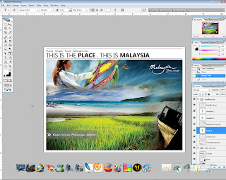
Haa. .Malaysia Truly Asia. *I just love the girl in baju kurung* Haha. Peace

+cheerio+

Assignment 1: The making

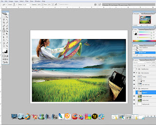
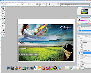
For this assignment, theres not much of fancy efx or filters used to produce the post card, just the basic ones that are from Tutorial 1 and 2, plus a little bit of idea and creativity! Simple but interesting. :D

Step 1:

Create a new document and set the background to white. Open Paddyfield.jpeg and place the image in the middle of the canvas. By using TRANSFORM tool, slightly resize and adjust the image accordingly. Next, duplicate the image and set the BLENDING MODE to SOFT LIGHT. The purpose is to richen the original color of the image. Sometimes the image may look dull or faded, therefore by applying this step it will further enhance its original color.


Step 2:

For the main element, several images will be used but the steps taken are pretty much the same except for the image arrangement. We start by opening Girlwau.jpeg. Drag the image over Paddyfield.jpeg and place it at the top. Since the image is small, again TRANSFORM tool is used to resize the image. Now that the image is aligned, next step is to make it blend in with the background image. The trick is very simple, hit E to activate ERASER tool and select FEATHER ROUND BRUSH. Set the brush OPACITY to 20-30% and start erasing the unecessary part of the image. The idea is to make it look like its part of the background image.


Step 3:

After done with the first element, lets proceed with the rest of the images. Step 2 is repeated on each and every image. This to ensure the color of all of the images will look even. If step 2 is not repeated, all of the images will not blend in well together. The images are placed accordingly to create a nice overall flow balance without making it look scattered all over the place.


Step 4:

Now that the main element is completed, a little adjustment on CURVES and LEVELS are made as a final step to finalise the image. The purpose is to adjust the brightness and the overall color. As a result, the image look more vibrant than before. Next i would like to add a small tag on the corner of the image along with a message. A rounded rectangle with 20px radius is created by using RECTANGLE tool, and light grey as fill. Select ERASER tool, SQUARE brush, and erase one end of the rounded rectangle. After that, set the OPACITY to 50%. The background for the tag is done. "Experience Malaysia today !" text is added to the tag (white SEGOE SCRIPT font, 12pt font size).


Step 5:

For final touch, a headline is added at the top of the image. Also, two horizontal lines are created to wrap up the headline (LINE tool, 2px weight), this to make the headline look neater. Assignment 1 is completed.

Asignment 1: Project charter

Project Charter Assignment 1

Assignment 1 Title: Printout Postcard for the theme “Malaysia, Truly Asia”.

Project Start Date: 25 November, 2008.

Project Finish Date: 28 November, 2008.

Project Manager: Azri Fikri B. Osman

HP: 012-6036465

Email: azri_F@ymail.com

Website: http://mcg1014-1081106703.blogspot.com/

Project Objective: Students are to create a multi-cultural event for a post card. The theme would be “Malaysia, Truly Asia” which is the official slogan for Malaysia Tourism. Students are to show the multi-cultural aspects of Malaysia culture or life as a positive feature to attract tourist into this country.

Approach:

How do you create the postcard?

The postcard is produced by combining a couple of images with diffrent settings and effects. All these are done in Photoshop CS2

Using what images?

Images that are found on google, and some personal images are used to make up the postcard.

What tools at Photoshop you use to edit the images?

There are various tools that are used to crate the postcard, such as crop, marquee, lasso, blur and smudge tools. Filters are also used to get nice effects.

Write here about the idea of your postcard, is it your own Idea or References?

I combined my own ideas plus some reference found on the internet. By combining from both source, the output result will be better as the ideas are not restricted to just one simple idea.

Roles and Responsibilities:

For time management, the time estimated to complete the assignment is 2-3 days, depending on the amount of time spent on each Photoshop session. Usually it only takes 1 day to complete any exercise given. But as for this assignment, a research is required in order to create the post card, e.g relevant images, layout, etc. Since i started on the 25th, I'll show some of assignment 1 progress to madam Lydia on the 26th to get feedback or comments to help further improve the result. Before submitting the assignment, these guidelines must be fulfilled :

  1. “Students are to submit the original PSD files (DO NOT FLATTEN THE FILE) together with the images used in the postcard. Call the file StudID_asssignment1.psd”.

  1. “Place the files in separate folders. One folder containing the PSD file called Postcard. The other images used are to be placed in a folder call Postcard_ref”.

  1. Print the postcard. Postcard size is 6x8 inches with 300 resolutions.

Comment:

For this assignment, its quite easy and direct. Not much of fancy efx or filters are needed to make it interesting. Just simple tools such as ERASER, BRUSH, CURVES, LEVELS and BLENDING MODE are used to make up the post card. Much of these tools are from Tutorial 1 and 2, so its not a big deal in completing this assignment. Overall i enjoyed doing this assignment, although the steps taken are the basic ones but the outcome was awesome! I'm very surprised with the final outcome. Looking forward for assignment 2.
Wednesday, November 26, 2008

Tutorial 2: Final outcome


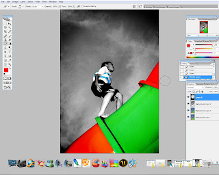
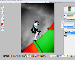
Here's the final outcome for tutorial 2. Just a simple editing with tutorial one efx.

Tutorial 2: The making

Step 1:

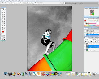
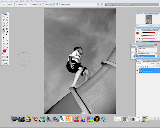
Open any of the 3 images provided. I chose the image of a boy playing at a playground. Duplicate the image. Next use DESATURATE to turn the top RGB image into Black and White. Then i opened EXPOSURE and play around with the sliders to fine tune the image.


Step 2:

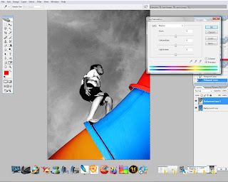
By using MAGNETIC LASSO tool, one part of the pipe is selected. Next ERASER is used to clear off the highlighted part. To change its color, open up HUE/SATURATION, mark the COLORIZE option box, and adjust accordingly.


Step 3:

For the other part of the pipe, just simply repeat step 2 to yield the same result. Also, for the monster cookie printing on the boy's t-shirt as well.


Step 4:

This is an additional step. Next a new layer is applied. Then, select RADIAL GRADIENT tool, and set the color to black and white. Apply the gradient and change the blending mode to OVERLAY. This to make it blend with the background. Use ERASER tool to clear off unnecessary portion of the gradient.


Step 5:

To finish off, merge down all layers. After that, RADIAL BLUR filter is applied to the image. the function is to create zooming efx.

Wednesday, November 19, 2008

Tutorial 1: Final outcome.

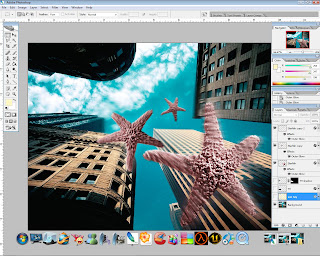
Tadaa. My starfish-licious tutorial 1. :D Not bad for a noob, though it takes hours to complete!

+Cheerio+

Tutorial 1: The making

The videos provided are very useful and easy to follow. The concept is similar like teaching new born babies, every single step is explained clearly and details are superb. So with a lil bit of time and google-ing hours, the first tutorial is done. Here's the step-by-step process:

Step 1:

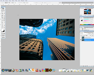
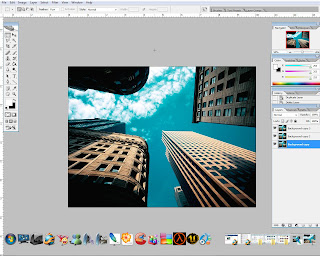
Open skyscraper.jpg in Photoshop. Here's the original skyscrapper image that is going to be used as background. The overall color seems to be quite dull, so to make it interesting i'm going to use HDR efx to give the background a new overall look. Well its not a real HDR effect, but something close to HDR.

Step 2:

Multiple layers with different layer settings are used to make up the so called HDR efx. The idea is to play around with different BLENDING MODE to achieve nice effect. In this case, i altered the color of the sky and clouds, plus a lil bit of lighting for the sky scrappers. This is just to enhance the surrounding environment.


Step 3:

Next is to add the star fish. Since the overall color of the background has changed, i think it would be better to change the color of the star fish also, so that they will blend better with the background image. After that, OUTER GLOW effect is applied to all star fish image with different level of opacity and fill. To get the falling efx, a mixture of GAUSSION BLUR, RADIAL BLUR , and FADE filters are used on each and every star fish image. Play around with the values to achieve good efx. We want to make it look as natural as possible without much exaggeration.

Step 4:

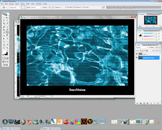
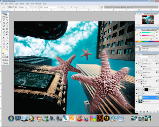
Next is the LCD TV screen. If the original image is used, it might interrupt the overall look and feel. Therefore, to make it blend in with the rest of the images, i've decided to change the color of the screen itself. Very simple, just use HUE/SATURATION, mark the COLORIZE option box, and use the sliders to get different combination of color. Again, the idea is to get it blend in well with the background image. The image still lacks in realistic, so SKETCH>HALFTONE PATTERN filter is used to render the real TV efx.


Step 5:

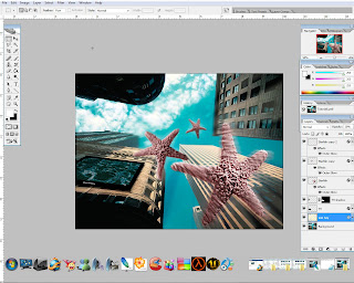
Next is to place the LCD TV created earlier to one of the building. FREE TRANSFORM tool is used to adjust the image so that it is aligned well with the building. Now, the TV needs some shadow, so DROP SHADOW efx is added and placed underneath the TV image. Adjust the opacity necessarily.


Step 6:

Lastly, i 've added a sunray efx to the overall image, to achieve a sunny day look. Its hard to see the efx actually, because the opacity of the layer is set to 15%. Anyways, im happy with it and i think the image look better now!


+cheerio+

Wednesday, September 10, 2008

The Poster


This is my final artwork. Abstract baby!

Tuesday, September 9, 2008

Step by step

For this poster, i didn't use any advanced techniques or special effects, just the basic and simple ones. I spent most of my time on preparing the sketch / drawing, since its going to be an abstract poster.

Step 1:

Scanned the sketch and open it in Illustrator. Usually we make it as a template, but for my poster, the sketch will be the template and the coloring layer.

Step2:

The sketch is pretty dirty, so i took a couple of minutes to clear the unnecessary artifacts. This so that later its easier for me to trace the sketch.

Step 3:

By using pentool, i traced the whole sketch in a new layer and named it outline. So now i have the original layer plus the traced layer. I'm going to use the live trace technique. But before that, i had to export the outline as a jpeg first, so that i can successfully use the live trace.

Step 4:

If i trace directly from the sketch itself, i wont be getting the exact drawing, due to the artifacts. Next, i opened the jpeg file and trace it using live trace. After tracing, i converted it to live paint so that the image can be colored by using live paint bucket.

Step 5:

This is the fun part. Coloring the image. I've decided to use colors ranging from earth, retro, and natural tones. The concpet is simple, just fill the image with any color randomly, this to create the 'abstract look' and variety.

Step 6:

After that, to give the background an old paper effect, i used to different images. The transparency of these images then set to different style, to achieve the old paper effect. Later, these images are placed underneath the main image.

Step 7:

To complete the poster, main title and other supporting elements are added and arranged accordingly. Also not forgetting the deforestation symbol created earlier.


cheers,

Sunday, September 7, 2008

Assignment 3: Sketch


Took me a couple of days to complete this sketch, its super complicated, but after the scan the sketch looks like this. Its kinda dirty. Well, its still workable and i loike it!

Saturday, September 6, 2008

Poster layout and Slogan

After much consideration, I've decided to use this type of layout for my poster.
Top: Main

Middle: Image / illustration

Bottom: Slogan / poster message


As for slogan, I chose:

"Stop deforestation, Stop global warming"

This slogan may not creative enough, but it suits both deforestation and global warming. We see this context as a whole, not just one part of it. We may stop or end global warming by eliminating its causes, in this case deforestation. Therefore, bigger impact can be achived.

Wednesday, September 3, 2008

Poster Reference


To get started, i searched the net for poster examples to get rough idea. I found a few photos with nice layout and color combination. Lets get started!

Wednesday, August 20, 2008

Assignment 2: Presentation


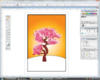
This is the end result of my illustration. Me don't really like it, because it doesn't look good. Any comments are welcomed.

*cheerio

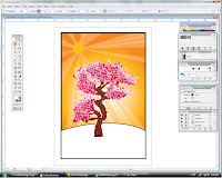
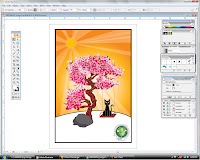
Assignment 2: The step by step process.

Step 1:

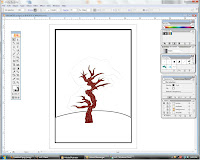
I opened my sketch in Illustrator and set it as template. Firstly, I traced the trunk by using pen tool and colored it.

Step 2:

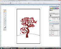
Next is the leafs. For this, i did my own leaf template by using pen tool. I decided not to use the normal leaf shape, instead i used star-like shape. This for the creative part. Heh. After that, I arranged the leafs, and its going to be a few layers with different colors. The first layer is maroon-ish in color.


Step 3:

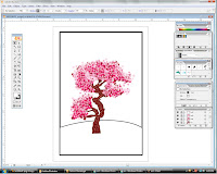
For the next few layers, i simply repeat step 2, but using different color tones, this to create the color shades so that it will look more realistic. After that, i added the details to further enhance the overall look. Now it look better doesn't it?


Step 4:

After completing the most hardest part, now lets add a background for the lovely tree. Well, to make it simple, i used gradient fill as the background. Orange and yellow for the color fill. Radial gives the best effect when combined together.


Step 5:


We've completed the background. Next is to add a few details. After much consideration, a bright sunny day sun would be the best idea instead of birds, clouds, or whatsoever. The sun is created by using ellipse tool. There are multiple layers for the sun, each with different level of opacity. As for the sun shine, i used the pen tool, again, and added different layers with different level of opacity and colors. The concept is mix and match. Very simple.


Step 6:

To complete the whole illustration, I've added other elements to go with the tree. All are created by pen tool. Fyi, pen tool is my fav tool in illustrator. hoho. For finishing touch, the awareness symbol is added to the illlustration.

There you go, the step-by-step process for my illustration.


Cheerio,

Assignment 2: sketches


These are the pre-sketches for assignment 2. I don't really have any idea at the moment. Will try to squeeze my brain for more brilliant ideas.

Later,

Sunday, July 27, 2008

Web references

For those who are interested in learning the advanced techniques in illustrator, check out the links below. Its quite good for improving your skills in Illustrator. Some does provide good tutorial both for Illustrator and Photoshop. Some may find that the tutorials are quite complicated. Never mine, just play around with the tutorial. You'll get used to it.

Links:

http://www.bittbox.com/illustrator/illustrator-tutorial-how-to-make-a-vector-glass-button/

http://veerle.duoh.com/

http://www.gomediazine.com/tutorials/intricate-patterns-in-illustrator/

http://www.gomediazine.com/tutorials/from-sketch-to-vector-illustration/


*Cheerio

Old sketches